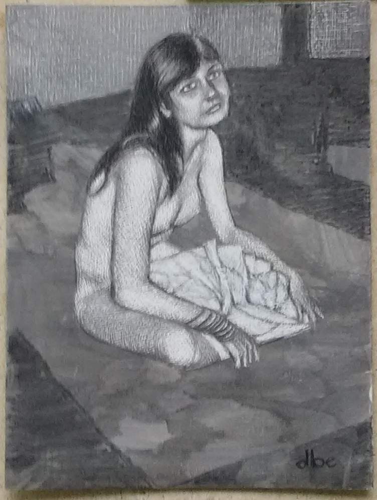
I’m going to stop here on this drawing. I did a little more scratching on the back wall, and decided to fill in the dark areas using charcoal. Her hair was rendered with a Wolff pencil, and the background with a large piece of soft charcoal. I had planned to use a white pastel on the blanket she’s sitting on, but I’m fond of how the undertone looks, and didn’t want to cover that up. I’ll let her sit a while longer as I clean up some spots, but consider it mostly done.
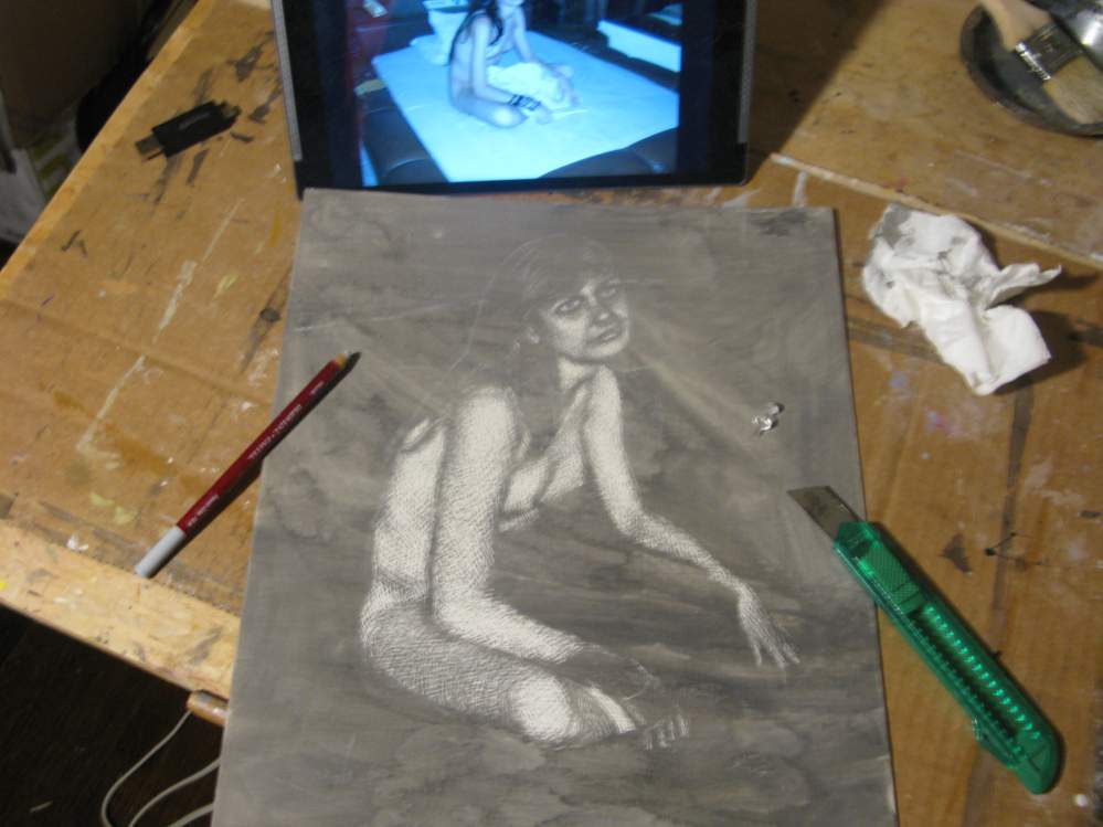
I’ve started a new drawing using the clay coated paper scratchboard I made in the video I posted last time. This is from an photo of mine that I took of my friend, Sharisse, sitting on the floor of her apartment. The grey tone is a wash of diluted sumi ink. I lightly outlined the figure on the paper with a grey pastel pencil to get her placed the way I wanted, and used the box cutter blade to roughly lighten the brightest areas. I then scratched over that with a push pin. It’s still a little rough on the modeling of her figure, but I’ll refine that later as I move on to the blanket and background areas. I’ll make a last pass on the darks at the end; although, I rather like it without that right now. We’ll see what it looks like when I get to that point.
I’ve gotten around to making another video on YouTube. This one demonstrates how I prepared a clay coated surface for drawing using thin coats of air-dry clay. Although this is specially made for ink drawing, it also works well for painting; however, if you want to use it with oils you would need to properly size the paper first. Feel free to leave a comment, and “like” if you find it useful.
For a few years now I’ve been using a digital picture frame viewer in the studio as a means to display reference photos while I work. Unfortunately, recently it stopped working, so I looked for a replacement. At first I thought I’d just get another cheap viewer that just shows pictures, but I wasn’t too crazy about the poor color accuracy, so I decided to look into getting a tablet. I found this one online for just under $50 new. It came today, and was easy to set up. It’s an Android tablet slightly bigger than the old viewer. at 10″. I need to find a stand for it, or may make one.
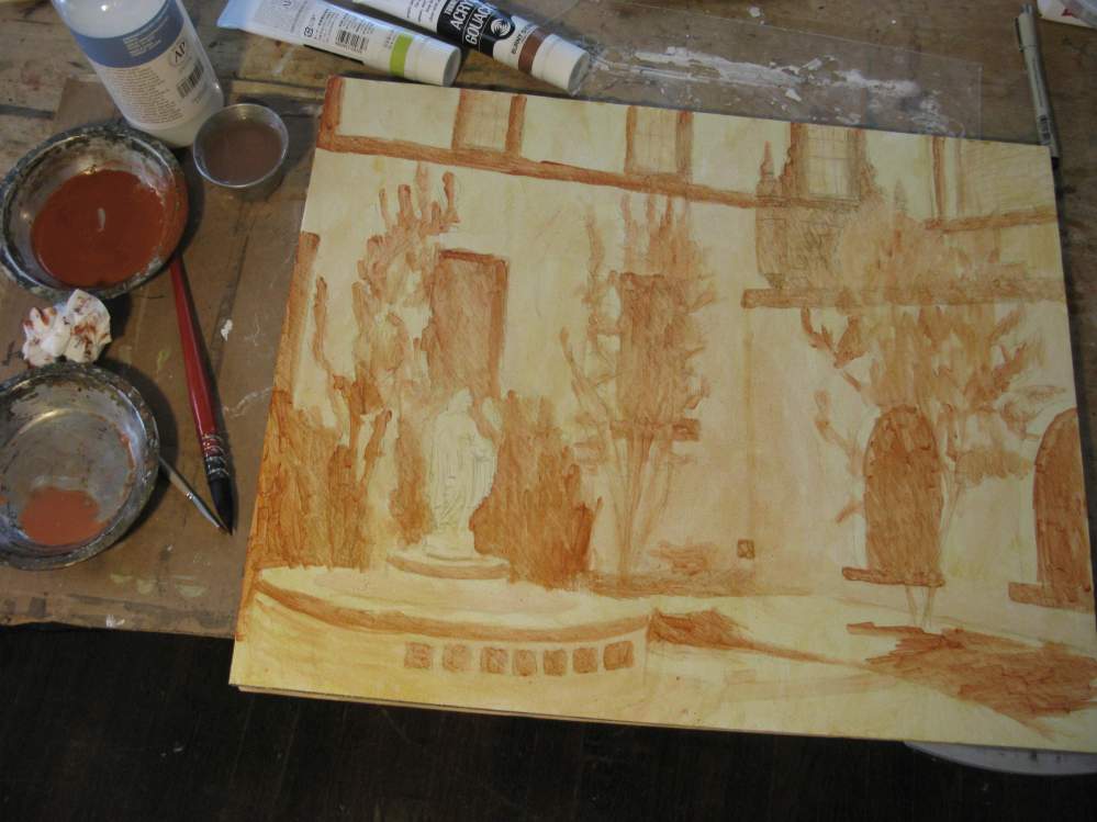
Making progress on the new painting. I’ve colored in most of the background and the statue. There will be much more refining of details here and there later, but this gives me the direction I need to see how to bring this all together. I like the contrast of the statue to the background. She pops out with good dimension. All of of this was made with Open acrylics. I’ll work more on that top corner next, and then the foreground area.
I’ve started a new painting. It’s based on some photos that I made of a courtyard at a local Catholic church that has a statue of Saint Mary. I’m planning to enter it in a local exhibit where the painting is due for delivery on the first week of April, so there’s a bit of a deadline. I think I can make it. I decided to do this one using Golden’s Open acrylics, but I started this layer using Turner’s acrylic gouache. The surface is canvas mounted to foamcore, 16 x 20″.
I have a new painting to show. It’s taken from a photo of mine where I saw this woman sitting on a bench downtown near where I live. Casein on board, 11 x 16″.
I’m considering this finished; although, there’s room for some clean up and details if I decide to add that. Right now I like the loose sketchiness of it, so I’ll leave it alone for a while. It accomplished what I set out to do, which was to test out this new clay coated surface I made. That has held up really well. No flaking, cracking, or lifting of the surface when wet. It behaved just fine, and takes paint well.
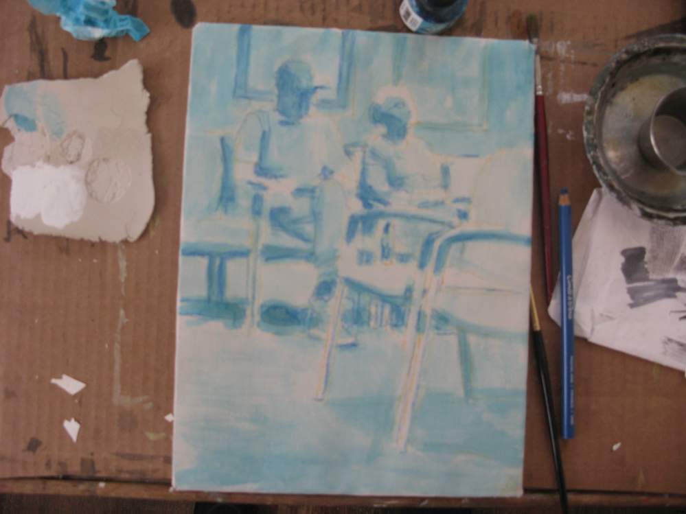
Finally got all the interrupting chores out of the way to start a new painting on the clay coated paper I created in the previous post. This is based on a drawing of a photo I took at a local doctor’s office, showing two elderly people in the waiting room. I decided to start off with a blue wash since the majority of the final local colors will be in warm tones. That color is not all that important in the end, as most of it will be covered up, so it’s mostly used to roughly help place the shapes and values. The clay coating is holding up well under this wash. We’ll see how well it does with gouache I plan to paint over it next.
This picture shows the Activa Supreme tile I made in the previous post that has now been mounted to a thin piece of plywood cut to the same size. This adds a little more weight to the tile, but not much, and has a better benefit of adding strength to resist cracking or damage. It’s now ready for painting, but before I get to that I wanted to test out another idea of creating a paint surface with this air-dry clay.
In this photo I’m painting thin coats of the clay onto a stretched sheet of paper. I’ve made a wet “slip” from the Activa clay by adding water to create a slurry that’s approximately 40% water. I do what I refer to as double coats much like how I apply traditional gesso, which is one thin coat in one direction that I let dry before adding another coat in the opposite direction. I repeat this nine times so that there are essentially eighteen thin coats on this sheet of paper.
Here is the finished surface with eighteen coats. It took about an hour to “paint” this slip in this manner. Ceramicists are familiar with clay slip for making repairs or adding decorations to their pottery, and this is roughly the same thing. There is also a way to make a thicker casting slip to pour into a mold, but it requires using deflocculants to keep the drying clay from cracking. I didn’t want to get into that. Painting the slip onto the paper in this way let me avoid any cracking issues. I could have painted this directly on a more firm surface rather than paper, but this slip is very wet and I’d likely have problems with that much water causing a board to warp and twist, which is not good for dried clay. In the photo above notice that I laid a piece of the tile sample on the corner, and that tile is slightly darker than the slip coated paper. Not sure why this is, since it’s the same material, and it’s opaque enough that the paper shouldn’t show through. Interesting.
Here I have removed the slip covered paper from the frame, and mounted it to a thin sheet of foamcore. This will give it the firmness I need without the extra weight of using plywood or hardboard. I will need to lightly sand this surface a little to smooth it out a bit, and then it will be ready for painting.
One of the issues I had comparing the tile I made with the Permastone or Wood putty casting material for painting is that this air-dry clay was more expensive by volume when made into an equal sized tile. However, using this slip method eliminates that problem. I estimate I only used about half a pound of clay to make enough slip to coat this sheet of 9 x 12″ paper. So, from that chunk of clay I should have enough to make 6 or 7 sheets at that size.
Finally ready now to do some painting on these, but first thing is to spend some time cleaning up the studio. It’s a mess in there.
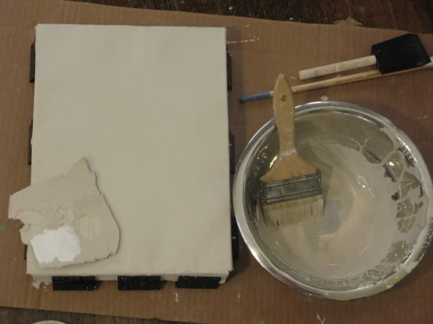
Following up on my previous post where I made a small tile out of Activa Supreme clay to use as a painting surface, I wanted to see how well paint would adhere to it. Before I get into that, I wanted to test out a couple things that I had read about it, and got some poor results, unfortunately. Information from the manufacturer said that the dried clay could be fired in a kiln. I don’t have one, but I figured an oven would work to at least help dry it out better. After only a few minutes in a hot oven the sample piece I made started to crack and blister. You can see the round explosions of moisture that erupted in the tile sample n the photo above. Maybe I should’ve let it air-dry longer, or used a lower heat (< 500.) The good news here is I don’t really have to fire or heat the tile to accomplish what I want with this material, but I did want to test this out. Another aspect I read was from watching a video demonstration of a sample piece of this being dropped onto a hard floor and not breaking. I tried the same thing on my wood floor, and you can see that it broke into several pieces. Not too surprising since I would expect the same thing from any piece of ceramic. As a result, I would recommend mounting the dry tile to a firm support like a wood panel, which I planned to do anyway. Glad I did all this on a sample piece.
Undeterred from these tests, I still wanted to see how well paint would adhere to the pieces that were left of my damaged sample. I painted a few swatches of color onto them using some homemade and commercial brands of gouache and casein paint. The paint went onto the tile very well. No beading up at all. The slight grey tone of the tile does cause the thinner layers of paint to have a more neutral appearance, but you could prime the surface with white first to brighten it up. Casein would work as a primer for gouache if you used a thin coat, and let it dry for a week or two. You can see a swatch of white on the large piece above. Acrylics had no difficulty on this. For oils, I would want to size the surface first with acrylic medium or shellac so that the paint wouldn’t sink in too much.
I’m pleased so far with how this is working, so next I’ll mount the small tile I made to a wood panel, and do a small painting on it. There’s one other test of an idea I have to see how I can make this material go further in an even thinner application, and I’ll show that in my next post.